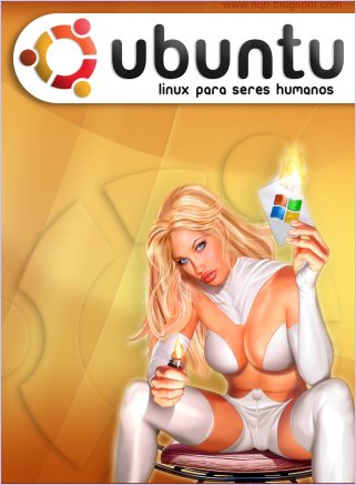
Hôm nay đi dạo chơi, kiếm cái hình cho Ubuntu để bỏ lên openvietnam, thì thấy một số hình ảnh thế này:
Và đây là những gì minh chứng cho điều đó  . Ngực, mông >> và những đứa bé có thể sử dụng Ubuntu với những hình ảnh được design rất đẹp
  ....
....
(Xin lỗi là F để ảnh lớn là vì bạn nào thích download thì download.)


Chúc vui
Why is the default desktop in Ubuntu BROWN?
The overarching theme of the first set of Ubuntu releases is "Humanity". This drives our choice of artwork as much as our selection of packages and decisions around the installer. Our default theme in the first four releases of Ubuntu is called "Human", and it emphasises warm, human colours - brown.
Yes, that's rather unusual in a world where most desktops are blue or green, and the MacOSX has gone kitchenware. Partly, we like the fact that Ubuntu is different, warmer. The computer is not a device any more, it's an extension of your mind, your gateway to other people (by email, voip, irc, and over the web). We wanted a feel that was unique, striking, comforting, and above all, human. We chose brown. That's quite a high risk choice, because to render brown your screen has to render subtle shades of blue, and green, and red. Even slight variations from the norm can shift the "brown" substantially. But monitors and LCD screens these days are increasingly of a standard that we felt the risk was acceptable. In Hoary and Breezy we have gone with a richer, redder brown, based on feedback from lower-end laptop and LCD screen users.
 . Ngực, mông >> và những đứa bé có thể sử dụng Ubuntu với những hình ảnh được design rất đẹp
  ....
....(Xin lỗi là F để ảnh lớn là vì bạn nào thích download thì download.)


Chúc vui


Comment